Still Magical

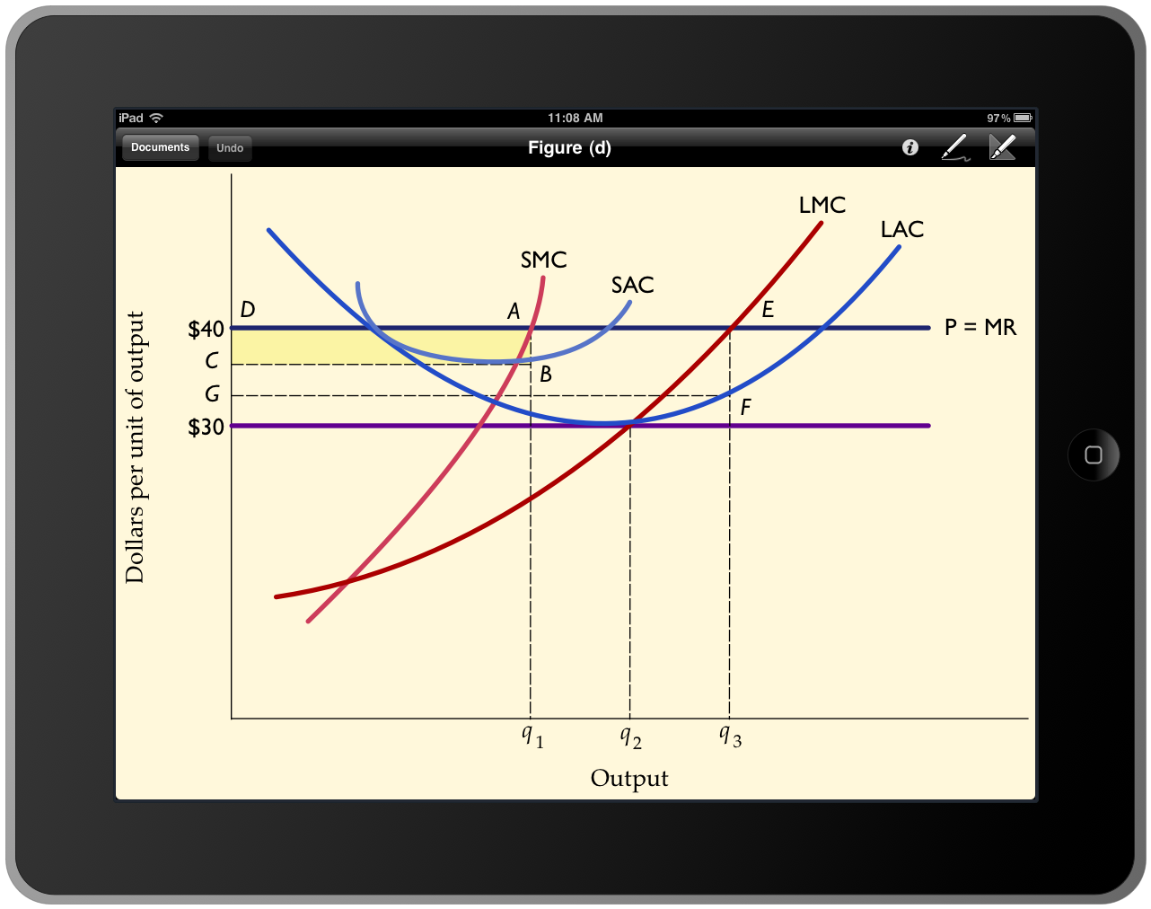
As part of testing our upcoming iOS 4.2 release of OmniGraphSketcher for iPad, I just threw together this graph — a more or less exact replica of a textbook economics diagram.  All on the iPad, without any fuss.

Economics diagram f on OmniGraphSketcher for iPad

I could email the PDF directly to a textbook publisher.

Despite the fact that I’ve been working on this app ever since the iPad was announced, the whole thing still kind of boggles my mind. Even though I know in detail how the app works, Apple’s term “magical” is the best way I know of to describe the experience of using it.

Airline infographic

An interesting infographic is being passed around today from the New York Times. (Click the excerpt below for the full graphic.)

Airline info graphic

I suspect that much of this was hand-crafted using an illustration program. Notice how the merger at the right end of Delta’s row maintains the vertical center from before the merger, whereas in most other places the incoming merger adjusts the vertical center by adding on to the top or bottom of the previous bar.