I found out today that IBM Research was working on scenarios for computers in education as early as the 1960’s (when programming meant feeding stacks of punched cards into a machine the size of a building).
The cloud is part of the app
With so many people now watching for Apple information leaks and rumors, their big announcements rarely contain big surprises anymore. However, there is usually a twist or two that no one foresaw, because few are as good as Apple at radically simplifying their products and services.
For me, the twist today was that the cloud is not some separate thing that you have to manage and think about. Instead, it is simply a feature of an app.
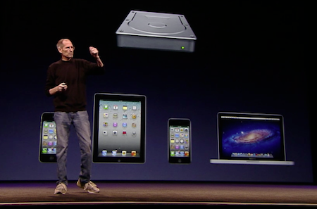
Because existing cloud providers offer third-party services that are sold separately, these providers have no choice but to emphasize the cloud as a separate thing. For example, Dropbox—probably the most elegant user experience out there—gives you a special folder on your file system that you can drag files into to tell Dropbox to sync them with the cloud. All files that live in that folder are automatically synced. Because of this, Steve Jobs told us, “Some people think the cloud is just a hard disk in the sky.”
Alternatively, some cloud services are integrated with web applications. For example, Google Docs stores your documents in the cloud and lets you view and edit them using a web browser. (Indeed, Google’s general goal seems to be to move all computing into the web browser, so not just your data but also the apps themselves live in the cloud. I’ve written previously about why I think that is shortsighted.)
Apple’s new “iCloud” offering brings to native apps the cloud integration that we’ve previously only seen with web applications. Moreover, it does this so seamlessly that the user is not really supposed to think about it at all. At Omni we spent a long time wondering how Apple was going to solve the problem of document sync in their iWork apps on the iPad. Then, last week, they shipped updates to those apps with no sign of cloud sync. What we didn’t realize was: that conspicuous absence was the whole point. The synchronization happens automatically, invisibly. There is no need for any user interface at all. Any file updated on one device is updated on all devices within seconds.
To make iCloud even more invisible, it’s free. There need be no user interface associated with paying. There need be no decisions about value and purchasing. You log in once when setting up the device, and that’s it. From then on, your various devices simply feel more like different views onto a single device. The automatic syncing makes it easier to operate the devices, not more complicated. You can spend less time managing the device and more time thinking about your content, your work, your friends.
There are bound to be remaining issues with sync conflicts, offline access, data plan limits, etc. But fast internet access is becoming widespread enough that this seamlessness does not seem out of the question.
The cloud is part of the app. The app is part of the cloud. If an app is cloud-enabled, that just means all devices automatically stay up to date.
Math interfaces
“Mathematics, as currently practiced, is a command line. We need a better interface.”
-Bret Victor [link]
Direct manipulation of differential equations
This demo video by Bret Victor is a perfect example of an innovative “direct manipulation 2.0” interface.
If I give my presentation again about scientific direct manipulation, I will certainly include it.
Interactive Exploration of a Dynamical System from Bret Victor on Vimeo.
(via John Gruber)
Kineticons
One of the best talks at CHI this year was by Chris Harrison of Carnegie Mellon, who presented work on what he calls “kineticons” — applying motion to icons and GUI elements of all scales. This is not animated icons per se, but motion applied to static icons. He came up with 39 kineticon motions and then asked 200 Amazon Mechanical Turk workers what they thought the motions meant. Among the interesting results was that “blowing in the wind” was a better indicator of movability than the iPhone springboard’s “jiggle” motion.
Apple has been a pioneer in using this type of motion to convey meaning, but Chris neatly shows how many more possibilities there are.
Direct manipulation vs. intelligent agents
Ben Shneiderman wrote in 1997:
Direct manipulation depends on… rapid incremental reversible operations whose effect on the object of interest is immediately visible. This strategy can lead to user interfaces that are comprehensible, predictable and controllable. Direct manipulation interfaces are seen as more likely candidates to influence advanced user inter- faces than adaptive, autonomous, intelligent agents. User control and responsibility are highly desirable.
That’s worth reading carefully and thoughtfully.
[Shneiderman, B. Direct manipulation for comprehensible, predictable and controllable user interfaces. Proceedings of the 2nd international conference on Intelligent user interfaces, 1997.]
More specifically:
Agent promoters believe that the computer can automatically ascertain the users’ intentions or take action based on a vague statements of goals. This author is skeptical that user intentions are so easily determined or that vague statements are usually effective. However, if users can specify what they want with comprehensible actions selected from a visual display, then they can more often and more rapidly accomplish their goals while preserving their sense of control and accomplishment.
I completely agree with Shneiderman. I wonder if “agent promoters” today have progressed enough to offer solid counterarguments.
Easy/hard
“It’s easy to make things hard; hard to make things easy.”
-via Bill Buxton

