I sometimes ask, “is that profound, or just obvious?” It used to just be a joke, but I’m starting to think it’s a bit more… profound.
What does it mean for a concept to be profound?
The word itself has a few meanings (e.g. “a profound silence”) but the sense I’m referring to is defined in the dictionary as “having or showing great knowledge or insight.” I think that is necessary, but not sufficient. Just because a concept requires great knowledge or insight to arrive at doesn’t make it profound. It also needs an air of deep, elemental truth. It strikes at the heart of the matter. It’s simple and powerful. It may have required deep expertise to uncover, but now that it’s out in the open, it’s clearly the truth.
My new working definition for profound is: obvious only in retrospect.
One of my favorite examples of this is how Einstein discovered the profound and strange properties of the universe known as special relativity. It was already well established that the speed of light is a constant; Einstein simply started asking questions about what would happen if an object started traveling close to that speed of light. Then he applied known physics equations to help him answer these questions. His lines of reasoning were quite simple, and not particularly controversial. His results were obviously true — but only in retrospect.
This concept also applies to design. Many of Apple’s best products have a simple elegance that makes you think “oh, of course.” You wonder why such products haven’t always looked or functioned like that, since it seems so obvious now that it’s in front of you. It has long been a tenet of design that the best, most thought-out, multiply-drafted designs are the ones that users don’t even notice, because they seem so obvious in hindsight. Indeed, I’m starting to think that if your design does not seem obvious in retrospect, you should be worried!
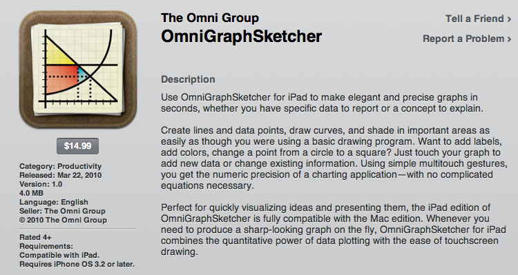
After I took an Economics class and studied some human-computer interaction, the basic interface of the Graph Sketcher software I designed always seemed pretty obvious. The devil was in the details, but the big picture wasn’t particularly controversial. It was simply the clear and logical solution to the needs of economics students and teachers.
When I submitted an academic paper about Graph Sketcher, one of the anonymous reviewers concluded their review by saying: “The interface techniques they have combined have been around a long time, and many others could have combined them but didn’t. This is one that seems obvious only in retrospect.”
At first, I didn’t know whether I should be offended by the comment. Looking back, I think it is one of the highest compliments my work has ever received.


